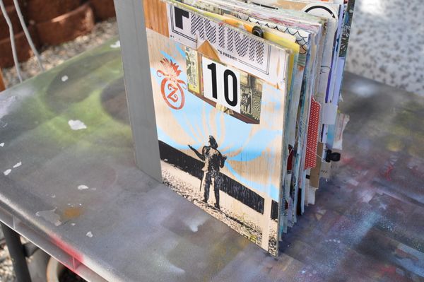
I changed my mind. You knew I would. I decided that Visual Journal No. 10 needed a jazzier cover after all. A combination of a graffiti poster with a smattering of collage and chica chica boom boom! Here it is!
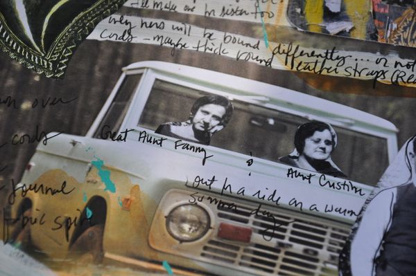
I still have 5 pages left in this book. 5 soft vanilla white pages to muck up. Hurrah! Do you get the Anthropologie catalogue? If so, you might recognize that truck below. I also used a slice of catalogue cover underneath the 10 above. I wish all of the pages in the catalogue were thick news-printy feeling like the cover. And that I found a new one in my mailbox every other day.
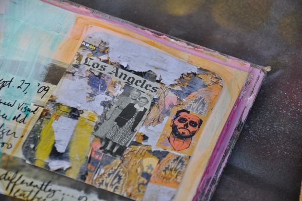
Gladys and Francine go out walking after midnight. In the moonlight. With 2 flashlights. Scouting out the new graffiti posters in their neighborhood and high-fiving each other when they find one.
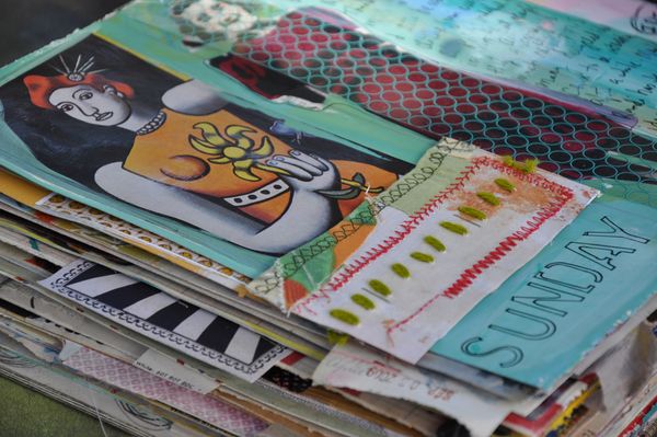
Before I gutted this book and turned it into Visual Journal No. 10 it was a book of modern art from 1950-something. I loved the striking red-head below. She wanted to come back and live in between the covers. So I let her. Too bad I tore off the part with the description below the painting. My bad.
I was pretty sure one of you clever people would be able to identify her. Update: she is none other than BIG JULIE painted by Fernand Leger (contemporary of Picasso) in 1945. Thanks Susan Warder! go HERE to see the full painting.
My friend Randi sent me THIS stenciled pumpkin idea. WOWZA! Stencilry students (and other stenciling fools) go grab your black spraypaint, paper doilies, and a few fat orange pumpkins!
Discover more from Dispatch from LA
Subscribe to get the latest posts sent to your email.




wow, it’s just so great. had to comment again
sigh sigh sigh…these is just so fabulously cool!
This journal is fabulous!
I usually just cover my pumpkin with red glitter, but this stencil idea is very cool…..
gladys and francine up to mischief again. The unmitigated gall!! Too wonderful. I just want to go he-he in my hand at their cuteness.
Love ALL of it, especially Aunt Cristin. She looks exactly like my own aunt. You know, the waved hair, the round specs and the tight lips. No fun at all. I have better hopes for your two!
Love the cover with the graffiti poster,that Z in the frame is really neat. Love love love Anthropologie catalogs…I cut out that same pick-up truck, but of course I will “save” it, while YOU on the other hand USED it right away! LOL The pumpkin link is really cool, makes me want to decorate a pumpkin now. In the new Martha Stewart Halloween mag, they used a paper doily and white face paint for one of the costumes named Gray Lady. It looks mighty fine. I’d do a link if I knew how.
by Fernand Leger – contemporary of Picasso – painter, sculptor, film maker
BTW what is the little green icon that appears we post a comment (and then disappears once it’s published.
Well, I don’t know about the redhead – but she looks like a Picasso to me.